Earlier this week, I read an article in FT Alphaville (https://www.ft.com/content/6b8462a4-b7b9-4bc9-af60-4c24e4491791) about the UK's Government Hospitality Wine Cellar (GWC), which the article playfully calls the country's "strategic wine reserve."
The GWC is so good at identifying up-and-coming wine that it is self funding: The GWC's advisory board sells their older, expensive wine in order to pay for new wine that they anticipate will rise in value over time. Some of the wine they buy is served at government events, but some is there as an investment. The GHC, which has existed since the end of World War I, ensures that people attending government functions will get tipsy on only the finest of vintages.
This week, we'll examine data that the reporters who worked on this story, Robin Wigglesworth (https://www.ft.com/robin-wigglesworth) and Louis Ashworth (https://www.ft.com/louis-ashworth), generously agreed to share with me (minus the proprietary bits). I'm grateful to them not only for writing this fun article, but also for their generosity in sharing this data.
Data and six questions
I posed six tasks and questions for you to answer this week. The learning goals include grouping, sorting data, and plotting with Pandas.
You won't have to work hard to find this week's data; I've enclosed it right here:
Here are my questions; my Jupyter notebook is enclosed at the bottom of this message.
Read the Excel data into a Pandas data frame. How many bottles of wine, according to this data set, does the UK have on hand? How many liters of wine does that work out to?
We start off by loading Pandas:
import pandas as pd
With that in place, we can then load the Excel spreadsheet into Pandas, using read_excel:
filename = 'Strategic Wine Reserve.xlsx'

df = pd.read_excel(filename)
We won't use all of the columns, but I didn't see a reason to remove any of them, since the resulting data frame is relatively small, with 517 rows and 27 columns.
I then asked you to find how many bottles of wine are in the GWC cellar. It might at first seem like we should invoke count on the TotalQuantity column:
df['TotalQuantity'].count()But of course, that just gives us the number of rows in the data frame, and by extension the number of types of wine. If we want to know how many bottles there are, we'll invoke sum, which totals the integers in that column:
df['TotalQuantity'].sum()The result is 32,259, which is ... quite a lot of wine.
But wait: How many total liters of wine is that? The bottles that I buy are typically 750 ml in volume, but we can check and see what volumes are in the GWC cellar by looking at the Size column:
df['Size'].value_counts()I invoked value_counts, telling me how many times each volume was in the data frame, and got the following:
Size
750ml    493
1.5L      17
375ml      5
500ml      1
1.0L       1
Name: count, dtype: int64
Most of the bottles are the same 750 ml size that I buy, but we see that some are larger and some are smaller. In theory, we can just multiply the TotalQuantity column by the Size column, sum up the result, and we'll get the total volume of wine in the UK's basement.
But of course, it's not at simple as that: The volumes (as you can see) are actually strings, not integers or floats. If we're going to perform a mathematical operation on them, we'll first need to turn them into numbers.
I decided to use the replace method to accomplish this, using a Python dict to indicate what current values (keys) should be translated into (values). Pandas complained when I used floats as the replacement values in replace, so I did it in two steps, first replacing the strings with other strings, and then using astype to convert them into floats:
(
    df['Size']
    .replace({'750ml':'.750',
              '1.5L':'1.500',
              '375ml':'.375',
              '500ml':'.500',
              '1.0L':'1'})
    .astype(float)
)
Now that we have a new column with a dtype of float, we can multiply it by the TotalQuantity column. Notice that I measured the bottle sizes in liters, such that 1.5 L became 1.500 liters.
We can normally multiply with the * operator, but we can't do that when using method chaining. We'll instead use the mul method, which performs the same operation, but as a method. We can then invoke sum and get the total:
(
    df['Size']
    .replace({'750ml':'.750',
              '1.5L':'1.500',
              '375ml':'.375',
              '500ml':'.500',
              '1.0L':'1'})
    .astype(float)
    .mul(df['TotalQuantity'])
    .sum()
)
The total is 24,159.125 liters of wine.
What is the mix of wine colors? Of countries of origin? Looking at the country with the greatest number of wines in the collection, what is the percentage breakdown of regions within that country?
What kinds of wine does the GWC contain? I decided to look at the colors, although you could probably learn as much (or more) from looking at the varieties, too. To find out the mix of colors, we can run value_counts on the Color column (which I definitely expected to be called Colour, but I digress):
df['Color'].value_counts()
I got the following:
Color
Red      327
White    159
Other     29
Rosé       2
Name: count, dtype: int64
We see that many of these wines are reds. The FT Alphaville article mentioned that for many occasions, the government will simply buy a lot of not-too-fancy white wines and then sell them. I'll also guess that red wine appreciates in value more over time. Regardless, we see that a lot of them are red.
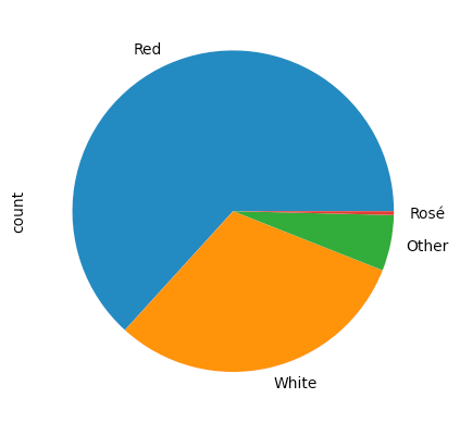
What if we want to make a pie chart from these numbers? (I had intended to ask you to do this, but forgot. Whoops!) We can invoke plot.pie to get such a plot. Note that we don't want to invoke plot.pie directly on the series, but rather on the output from value_counts:
(
    df['Color']
    .value_counts()
    .plot.pie()
)
There isn't anything wrong, per se, with the result:

Maybe it's just me, but I find it weird to have the "red" portion of the pie colored in blue, the "white"portion of the pie in orange, and the "rosé" of the pie in red. We can specify the colors used by passing a list of strings to the colors keyword argument:
(
    df['Color']
    .value_counts()
    .plot.pie(colors=['red', 'white', 'gray', 'pink'])
)
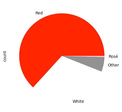
We get the following pie chart as a result:

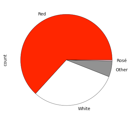
The good news is that it worked. The bad news is that the "white" section isn't really visible, because the background is white, too. We can fix this by passing the wedgeprops ("wedge properties") keyword argument to .plot.pie, giving it a dictionary that it should pass along to the underlying Matplotlib implementation. Here, I pass edgecolor and linewidth, ensuring that we get a thin, black line around each wedge of the pie:
(
    df['Color']
    .value_counts()
    .plot.pie(colors=['red', 'white', 'gray', 'pink'],
              wedgeprops={'edgecolor': 'black', 'linewidth':0.5})
)
The result:

What about the distribution of countries? We can again use value_counts:
df['Country'].value_counts()We can see that a great deal of the wine is from France:
Country
France            360
United Kingdom     46
Portugal           37
Germany            15
Italy              13
Australia          11
South Africa        8
New Zealand         8
USA                 7
Spain               4
Austria             2
Argentina           1
Japan               1
Canada              1
Russia              1
Chile               1
Brazil              1
Name: count, dtype: int64
France is very clearly the source of most wines in the collection. But French wine is famously tied to a specific region, not to the overall country. What regions to those wines come from?
To find out, we can keep only the rows where the Country is 'France', and then use value_counts on the Region column:
(
    df
    .loc[lambda df_: df_['Country'] == 'France']
    ['Region']
    .value_counts(normalize=True)
)
I used loc and lambda here; when the function that we create with lambda is invoked, it returns boolean series that loc uses to keep only a subset of the rows – those describing French wines. We can then ask for just the Region column, and then invoke value_counts on it. Here, I passed normalize=True to value_counts, which returns percentages rather than absolute numbers:
Region
Bordeaux            0.538889
Burgundy            0.277778
Champagne           0.050000
Rhône               0.047222
Cognac              0.038889
Loire Valley        0.016667
Alsace              0.016667
France              0.008333
Southwest France    0.005556
Name: proportion, dtype: float64
We can thus see that of the French wines stored in the UK's cellar, more than half are from Bordeaux. Only 5 percent are from Champagne, so they might not be celebrating at these events as much as you thought.
If you aren't comfortable hard-coding 'France' as the country, you can calculate the most-common country by invoking mode, which returns the most frequent value in the series:
(
    df
    .loc[lambda df_: df_['Country'] == df['Country'].mode().iloc[0] ]
    ['Region']
    .value_counts(normalize=True)
)
Notice that we can't just compare the result of mode with the Country column. That's because it returns a series – normally containing one element, but if multiple elements appear the same number of times, then they'll all appear. I use iloc here to retrieve just the first one.

