


This week, we looked at relief offered by FEMA, the Federal Emergency Management Agency (https://fema.gov), to a variety of disasters over the years. FEMA has provided food and water, as well as numerous other type of assistance, to people affected by Hurricane Helene, which passed through (among other places) the Southeastern United States.
I've heard about FEMA many times in the past, especially in the context of hurricanes, and I thought that it might be interesting to find out how often they're called upon to do their jobs, what sorts of disasters they deal with, and where the disasters typically occur.
Data and six questions
This week's data comes from FEMA, which like all US government agencies, publishes a great deal of data about its work. We can get a list of disasters on which it has worked, classified by type, date, and location (but not budget), from
https://www.fema.gov/openfema-data-page/disaster-declarations-summaries-v2
For this week's tasks, we'll use the Parquet data file that FEMA provides. Parquet is a binary format used by the Apache Arrow project (https://arrow.apache.org/). You can find the Parquet file (along with other formats) in the "Full data" section of the data page. You can download FEMA's Parquet file itself from:
https://www.fema.gov/api/open/v2/DisasterDeclarationsSummaries.parquet
We'll also use some data classified by FEMA regions. Information about those regions is at:
https://www.fema.gov/about/organization/regions
Here are my detailed solutions and explanations for this week. As always, a link to the Jupyter notebook I used to solve the problems is at the end of this message.
Here are my questions:
Create a data frame from the Parquet file. Make sure that all of the columns describing dates have a dtype of datetime.
We'll start by loading Pandas:
import pandas as pdWith that in place, we can then load the Parquet file:
filename = 'DisasterDeclarationsSummaries.parquet'

df = (
    pd
    .read_parquet(filename)
)
It turns out that this works just fine; we get a data frame with all of the data in it. But upon closer examination, it seems that not all of the "date" columns were actually stored using datetime dtypes. That seems weird, but it makes sense if you consider that Parquet doesn't automatically set any types. Rather, it stores the data as it was told to store it. So if someone never made the effort to turn the "date" columns into datetime dtypes, Parquet will dutifully store them as strings.
To get around this, we'll need to overwrite the existing columns with datetime versions of themselves, invoking to_datetime on each of the columns.
The easiest way to do this, at least if we're using method chaining, is with the assign method. This lets us add a new column to the data frame on which we're working by passing a keyword argument. If the key matches an existing column, then we replace the column with the passed value – which can be a series or the result of a function call, such as a lambda.
In this case, I called assign with four keyword arguments. Each basically just replaces the existing column with a datetime version of the existing column:
filename = 'DisasterDeclarationsSummaries.parquet'

df = (
    pd
    .read_parquet(filename)
    .assign(declarationDate =
            lambda df_: pd.to_datetime(df_['declarationDate']),
           incidentBeginDate =
            lambda df_: pd.to_datetime(df_['incidentBeginDate']),
           incidentEndDate =
            lambda df_: pd.to_datetime(df_['incidentEndDate']),
           disasterCloseoutDate =
            lambda df_: pd.to_datetime(df_['disasterCloseoutDate']),
           )
)
With this in place, we have a data frame with 66,895 rows and 28 columns. All of the date-related columns now have the right dtype, too.
I should note that using a datetime rather than a string not only provides us with additional ability for calculations, but also reduces the size of the data, both on disk and in memory. The disk file we loaded is 6.3 MB in size, but after performing this transformation, it's only 5.7 MB in size. (I saved it with to_parquet after doing so.) And datetime values are only 64 bits, as opposed to strings, which are typically much larger. This is another example of how using an appropriate dtype isn't just nice, but really improves the performance of your system.
Create a bar graph showing the number of disasters that FEMA has handled in each year, starting in 2000. (Use the incidentBeginDate as the source of the year.) The bar should be subdivided into colored sections indicating the types of disasters. Only include the 5 most common disaster types. Does any year stand out? How different do things look if we count every entry in the data set as a separate disaster, vs. every unique disasterNumber?
I thought it would be interesting to see just how many disasters FEMA has to deal with each year, and to plot that, to see if the numbers have gone up or down over time. The best way to do this, I think, is to create a pivot table in which the index contains years and the columns contain disaster types, with the cells containing integers – the count of how many values match each type for each year.
Since FEMA deals with so many different types of disasters, I asked you to only look at those in the top 5. My favorite way to find the 5 most common elements is to run value_counts on the incidentType column, then get the top 5 values with head(5), then grab the index from there.
But I'm not interested in the top 5 incident types on their own. Rather, I only want those rows in the data frame whose incident type is in those top 5. I'll thus use isin inside of a .loc to keep only those rows whose incidentType is in that list:
(
    df
    .loc[lambda df_:
      df_['incidentType'].isin(
          df_['incidentType'].value_counts().head(5).index)]
)
We'll need the year, and while we can get it with dt.year, that's not going to be good enough when we create a pivot table. So I decided to use assign to create a column called incidentBeginYear, containing just the year. And while I could then filter based on dt.year or the incidentBeginYear column, I figured that I had the column already, so why not use it? Here's how my query thus looks so far:
(
    df
    .loc[lambda df_:
      df_['incidentType'].isin(
          df_['incidentType'].value_counts().head(5).index)]
    .assign(incidentBeginYear =
              lambda df_: df_['incidentBeginDate'].dt.year)
    .loc[lambda df_: df_['incidentBeginYear'] >= 2000]
)
The data is now in place for us to create a pivot table. It's easiest to think of a pivot table as a 2-dimensional groupby, but working on two categorical columns (one for rows, the other for columns). We're interested in counting the number of intersections between these categories, so our aggfunc will be count, and we can choose any column we want for counting, so I'll just choose id. We then invoke pivot_table with the appropriate keyword arguments:
(
    df
    .loc[lambda df_:
      df_['incidentType'].isin(
          df_['incidentType'].value_counts().head(5).index)]
    .assign(incidentBeginYear =
              lambda df_: df_['incidentBeginDate'].dt.year)
    .loc[lambda df_: df_['incidentBeginYear'] >= 2000]
    .pivot_table(index='incidentBeginYear',
                 columns='incidentType',
                 values='id',
                 aggfunc='count')
)
The resulting data frame shows us how many disasters of each type took place in each year. We can then create a bar plot with plot.bar. But that will give us a separate bar for each column of the data frame; I asked you to have a single bar for each year, divided into a colored segment for each incident type. To do that, we pass stacked=True as a keyword argument to plot.bar:
(
    df
    .loc[lambda df_:
      df_['incidentType'].isin(
          df_['incidentType'].value_counts().head(5).index)]
    .assign(incidentBeginYear =
              lambda df_: df_['incidentBeginDate'].dt.year)
    .loc[lambda df_: df_['incidentBeginYear'] >= 2000]
    .pivot_table(index='incidentBeginYear',
                 columns='incidentType',
                 values='id',
                 aggfunc='count')
    .plot.bar(stacked=True)
)
The result looks like this:
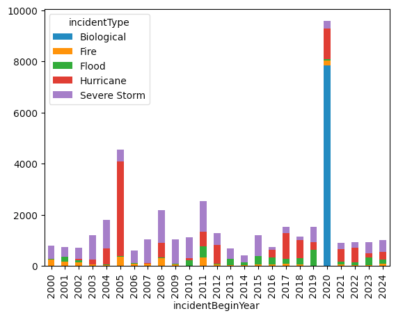
As you can see there was quite a rise in FEMA disasters in 2020. And whadaya know, the overwhelming majority were "Biological" in nature.
But note that this is counting each individual FEMA request as a separate disaster. That's not wrong, but this means that if a disaster is spread across multiple counties and states, we'll see numerous rows for each one. What if we just count each incident as a single FEMA event?
We can do that by invoking drop_duplicates on the data frame, indicating that we want to keep the disasterNumber column unique, keeping only the first row with each disaster ID number:
(
    df
    .drop_duplicates(subset='disasterNumber')
    .loc[lambda df_:
        df_['incidentType'].isin(
            df_['incidentType'].value_counts().head(5).index)]
    .assign(incidentBeginYear =
            lambda df_: df_['incidentBeginDate'].dt.year)
    .loc[lambda df_: df_['incidentBeginYear'] >= 2000]
    .drop_duplicates(subset='disasterNumber')
    .pivot_table(index='incidentBeginYear',
                 columns='incidentType',
                 values='id',
                 aggfunc='count')
    .plot.bar(stacked=True)
)
This results in a different graph:
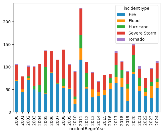
According to this plot, 2020 certainly had a larger share of biological problems than most others, but it didn't dominate as much as in the other plot. Of course, perhaps the pandemic indicates that we should count each individual incident, because the notion that 2020 had fewer biological issues than 2011 seems, on the face of it, a bit ridiculous.