


This week, we looked at data about international trade. This topic has been in the news quite a bit lately, with Donald Trump's use of emergency powers to enact (and change, and re-change) tariffs affecting many economic indicators all over the world – and not in a good way. Just today, Felix Salmon reported that in the wake of the emerging trade war, fund managers worry that the US economy might be in for a "hard landing," and are moving assets out of the United States (https://www.axios.com/2025/04/17/trump-tariffs-global-fund-managers).
I decided to look at trade figures not just from the United States, but from a number of countries – basically, the G7, as well as Mexico, India, and China, because of their size and (to date) positive trade relationship with the United States. The data came from the United Nations "Comtrade" data portal (https://comtradeplus.un.org/), which catalogs international trade. You need to register and pay for large data sets, but up to 100,000 records can be downloaded free of charge.
Beyond the usual data-analysis topics that I address in Bamboo Weekly, I asked you to use a relatively new tool in the Python world, Marimo (https://marimo.io/). Marimo is a Python notebook in the tradition of Jupyter, but with functionality and tweaks that aim to solve many of the frustrations and problems that people have had to date. I created a YouTube video introducing Marimo earlier this week at https://youtu.be/tLyjRfkyfFg?list=PLbFHh-ZjYFwHbNO7aOe1IXUlHa9ibGQJC, and expect to make more such videos in the future.
Data and six questions
As I wrote above, this week's data comes from the UN's Comtrade site. I went to their "TradeFlow" page at https://comtradeplus.un.org/TradeFlow , and entered the following:
- Type of product: Goods
- Frequency: Annual
- Classifications: BEC
- Periods: 2024, 2019
- Reporters: USA, Canada, France, Germany, Italy, United Kingdom, Japan, China, India, Mexico
I then downloaded the results in Excel format, into a file called TradeData.xlsx. (I tried the CSV-formatted file, but decided to use Excel in the end, partly because there were some weird encoding issues and also it seemed to cut off the data earlier than Excel.) I first needed to register and log in; this allowed me to download the data. Note that free users (like me) can only download 100,000 rows – which means that if your query will result in more than that, you'll only get the first 100,000. In my case, the query returned 78,741 rows and 47 columns, so we were safe.
Learning goals this week include Marimo, pivot tables, sorting, and plotting.
If you're a paid subscriber, then you'll be able to download the data directly from a link at the bottom of this post, download my Marimo notebook, and click on a single link that loads the notebook and the data into a browser-based (i.e., WASM) version of Marimo.
Also: A video walk-through of me answering this week's first two questions is on YouTube at https://youtu.be/ROWu-Ntc4Jg?list=PLbFHh-ZjYFwG34oZY24fSvFtOZT6OdIFm. Check out the entire Bamboo Weekly playlist at https://www.youtube.com/playlist?list=PLbFHh-ZjYFwG34oZY24fSvFtOZT6OdIFm !
Here are the six tasks and questions:
Start a Marimo notebook. Import the data into a data frame, removing rows in which the partnerDesc is 'World'. Keep only the columns refYear, reporterDesc, flowDesc, partnerDesc, and fobvalue. Without using any code, sort the rows by the fobvalue column. Which country imports the greatest dollar amount of products, and from where?
I started a Marimo notebook from the command line with marimo edit. From there, I clicked on the link to create a new notebook. Because Marimo doesn't immediately associate a notebook with a filename, and thus doesn't immediately start saving it to disk, I quickly gave it a name (BW 114) which was stored as BW 114.py in the directory from which I ran Marimo).
Once I created the initial notebook, I started to work, just as I usually do, by loading up Pandas:
import pandas as pdNext, I defined the filename variable to refer to the Excel file that I had downloaded from Comtrade. I invoked read_excel, passing it not only the filename, but also the usecols keyword argument, naming the columns I want to keep. I should note that this only worked because read_excel found the column names in the first row of the Excel spreadsheet, and used those names for our columns:
filename = 'data/TradeData.xlsx'

df = (pd
     .read_excel(filename,
                usecols=['refYear', 'reporterDesc',
                         'flowDesc', 'partnerDesc',
                         'fobvalue'])
     )
I asked you to remove rows in which partnerDesc is 'World'. To do that, I took the data frame returned by read_excel, and invoke loc on it, giving it a lambda function that returns True if partnerDesc isn't equal to 'World':
df = (pd
     .read_excel(filename,
                usecols=['refYear', 'reporterDesc',
                         'flowDesc', 'partnerDesc',
                         'fobvalue'])
     .loc[lambda df_: df_['partnerDesc'] != 'World']
     )
The result is a data frame with 76,749 rows and 5 columns.
I then asked you to sort the rows by the fobvalue column, and find out which country imports the greatest dollar amount of products. However, I asked you to do this without writing any code.
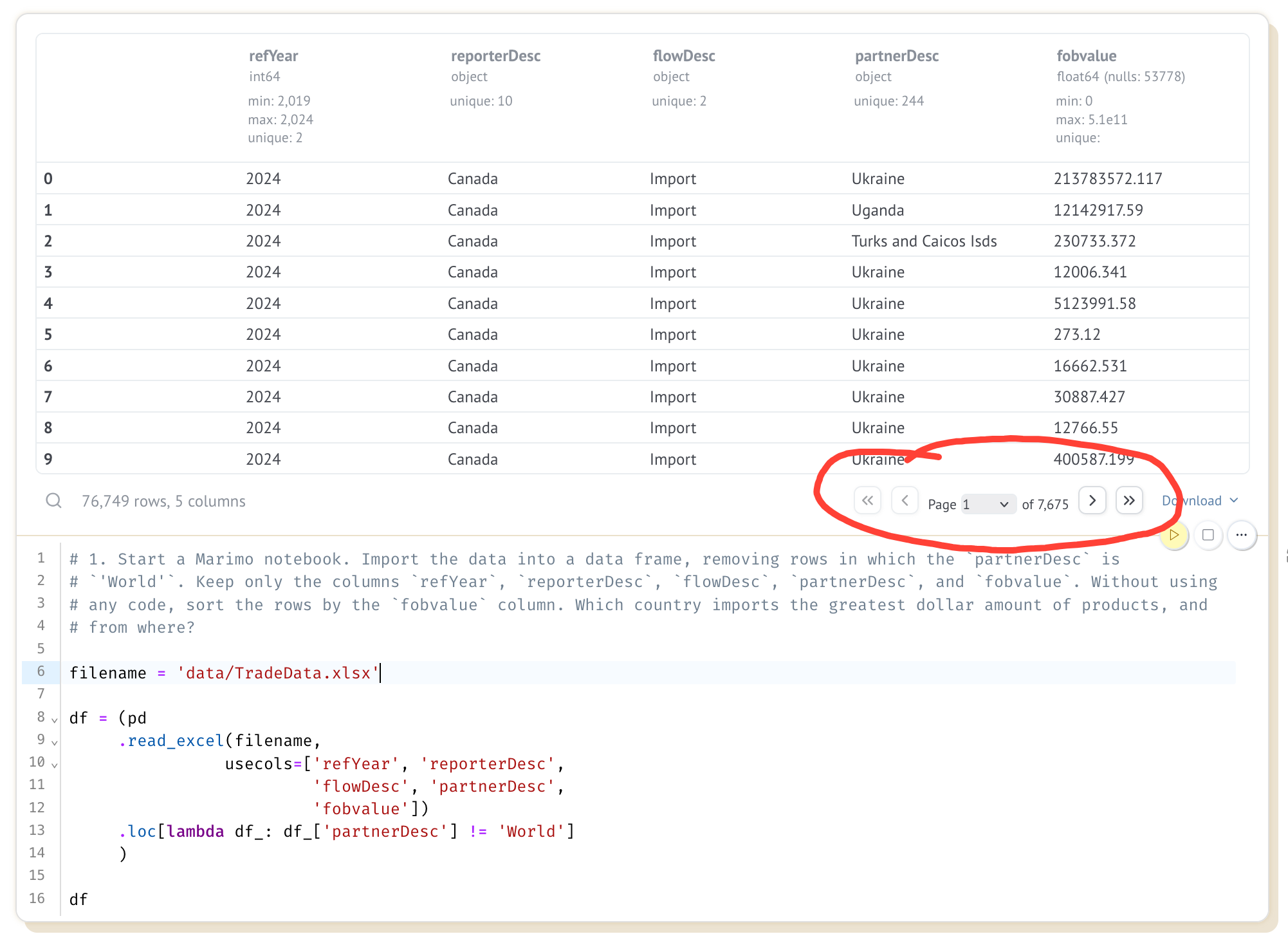
There are two parts to solving this problem. First, if we put df in the final row of a cell, then we'll get the data frame returned and displayed. Marimo does this similarly to Jupyter, but also adds some twists – first, it labels the columns and shows their dtypes. Second, it only shows the first few rows, but provides us with pagination controls that'll let us move backward and forward in the data frame.
Here is a screenshot of the Marimo notebook I created. On the bottom is my query, and on the top is the output. I've marked the pagination controls in red:
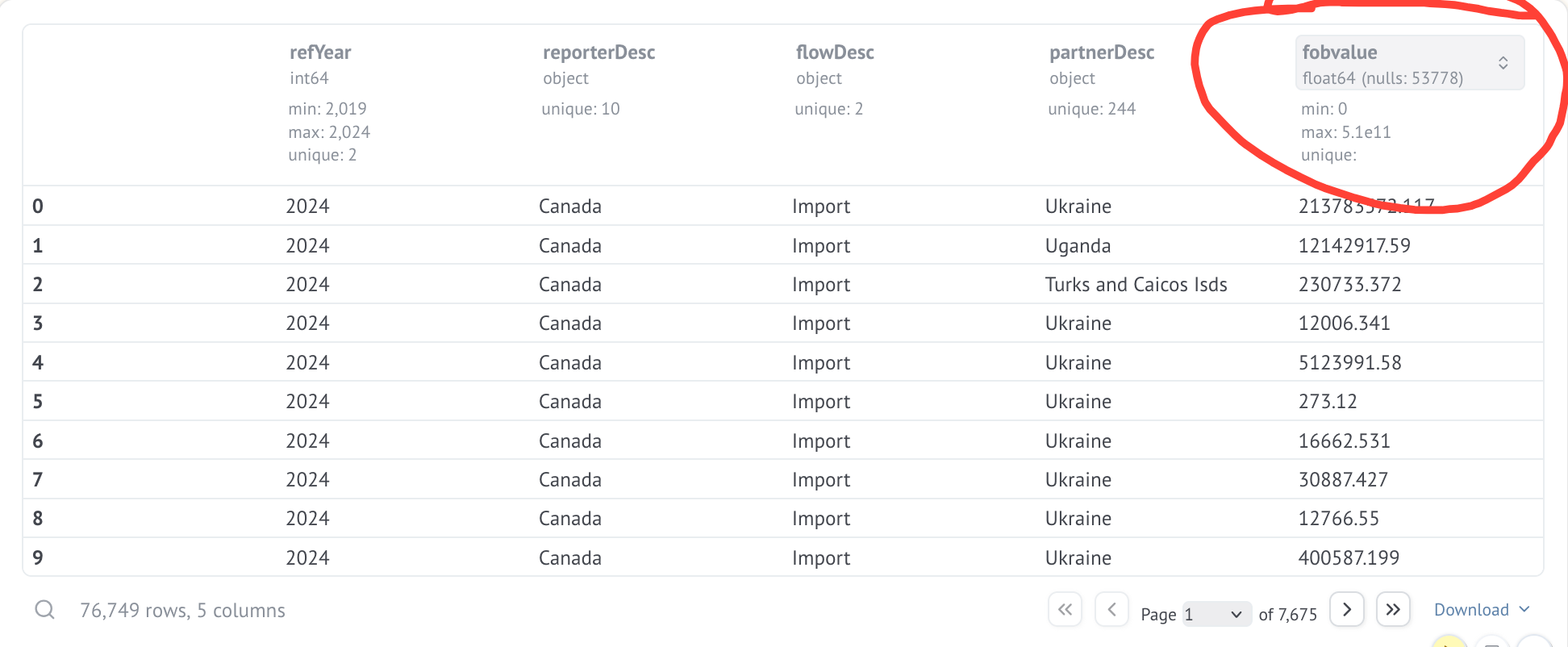
I asked you to sort the rows in df by the fobvalue column, which represents the value of trade between two countries. We can do this by hovering above one of the column headers, as I did here with fobvalue:
If you click on the arrow, you'll then get a menu of options. Among the options are "Asc" and "Desc", which allow you to re-order the display of rows in either ascending or descending order:
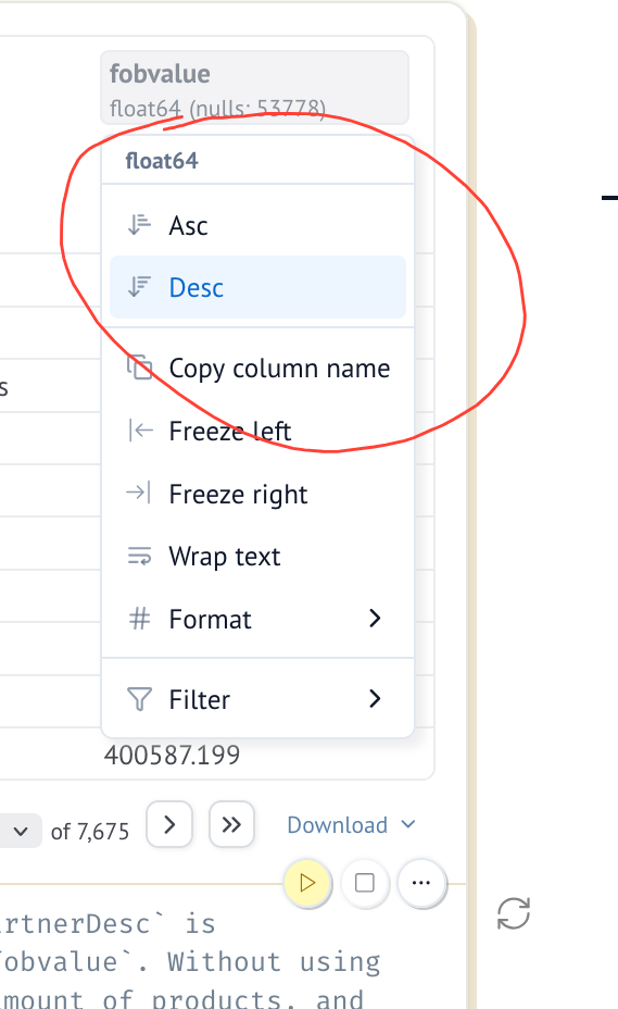
By selecting "Desc", I got the rows in descending order, according to fobvalue. The top row indicated that the top bilateral trade relationship is the United States, which in 2024 imported $505,827,647,199 (i.e., more than $505b) of goods from Mexico.
Define n to be 10. Create a bar plot showing the n countries from which the US imported the most in 2024, and the fobvalue. Create a second bar plot showing the n countries to which the US exported the most in 2024, along with the fobvalue. What happens when you update n?
The first thing I did was create a cell with a single line:
n = 10That assignment didn't really do much; it created the variable n, assigned the integer 10 to it, and that's basically the end. But in the next cell, I then used n to create a bar plot.
For the plot to work, I used loc and lambda several times, ensuring that I had only records from 2024, only records reported by the US, and only records having to do with imports:
(
    df
    .loc[lambda df_: df_['refYear'] == 2024]
    .loc[lambda df_: df_['reporterDesc'] == 'USA']
    .loc[lambda df_: df_['flowDesc'] == 'Import']
)
I then used set_index to use the partnerDesc trade-partner country's name as the index, and retrieved the fobvalue column from the data frame:
(
    df
    .loc[lambda df_: df_['refYear'] == 2024]
    .loc[lambda df_: df_['reporterDesc'] == 'USA']
    .loc[lambda df_: df_['flowDesc'] == 'Import']
    .set_index('partnerDesc')
    ['fobvalue']
)
This gave me a series showing US trade partners in 2024; the country names are the index, and the values of the series reflect how much was imported from each.
I then used nlargest to retrieve only the n highest values, giving us the n biggest sources of US imports. Then I used plot.bar to get a bar plot of how much is being imported from each country:
(
    df
    .loc[lambda df_: df_['refYear'] == 2024]
    .loc[lambda df_: df_['reporterDesc'] == 'USA']
    .loc[lambda df_: df_['flowDesc'] == 'Import']
    .set_index('partnerDesc')
    ['fobvalue']
    .nlargest(n)
    .plot.bar()
)
The result:
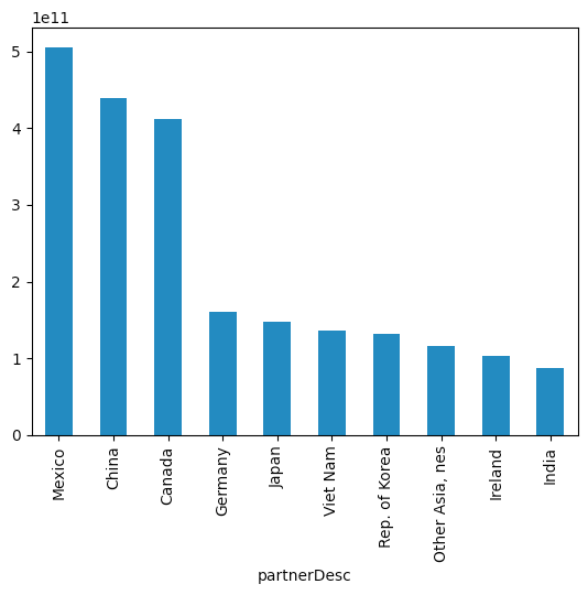
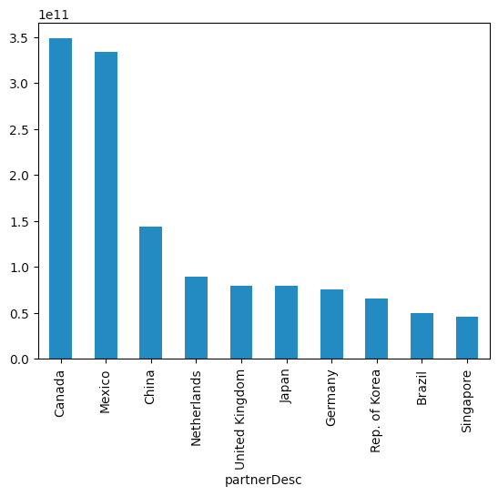
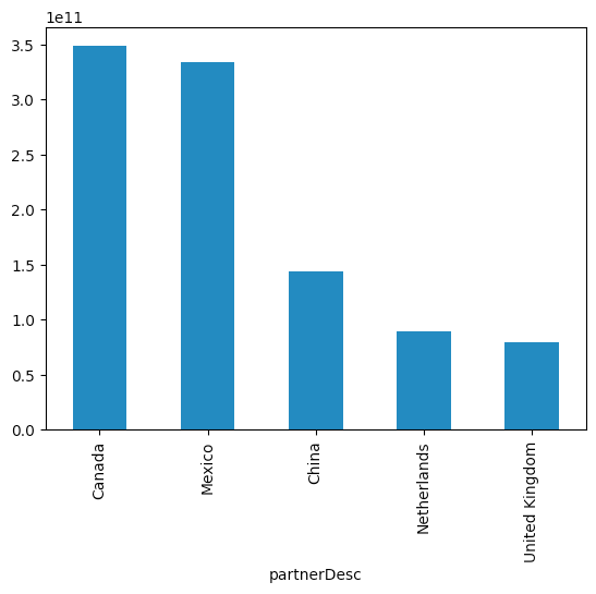
We see, from this plot, that the US imports the most from Mexico (matching what we saw before), followed by China and Canada. Germany, the fourth-largest source of imports, is less than half the dollar value of any of the first three.
I asked you to create a similar plot for exports; the query was nearly identical, with only the flowDesc condition changing:
(
    df
    .loc[lambda df_: df_['refYear'] == 2024]
    .loc[lambda df_: df_['reporterDesc'] == 'USA']
    .loc[lambda df_: df_['flowDesc'] == 'Export']
    .set_index('partnerDesc')
    ['fobvalue']
    .nlargest(n)
    .plot.bar()
)
And we get the following:
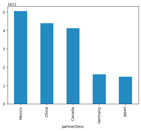
We see that the two top importers of US goods are Canada and Mexico, followed somewhat distantly by China, the Netherlands, and the United Kingdom.
So far, these results don't seem very different from what we would get with Jupyter. The key difference with Marimo happens if we return to the cell in which we defined n, and change its value to something else. For example, if I change it to be n=5, and then execute that cell, Marimo automatically re-runs all of the cells that reference n, including our two bar-plot cells.
In other words, updating the value of n causes a chain reaction, recalculating the two queries that produce bar plots, resulting in the following displays with no additional work on our part:
And
I can, of course, change the value of n to anything I want, and the plot will immediately update. This is possible because Marimo keeps track of the cell in which a variable is defined, and also the cells in which it is used and referenced. Updating the assignment cell results in the dependent cells all being rerun.