


This week, we looked at US airport traffic. This topic has been in the news quite a bit lately, with numerous reports of people without US citizenship being jailed, expelled, or just refused entry into the country. This has led to a reported huge drop in air traffic between Canada and the United States (https://onemileatatime.com/news/airline-demand-canada-united-states-collapses/), and even to the Python Software Foundation's announcement that if people are uncomfortable traveling to the US from other countries, they can get a full refund on their conference ticket.
This week, we'll thus be looking at air travel into the US over the last two years, at a number of US airports. We'll try to determine whether the number of non-US citizens has really dipped in recent weeks, and generally look at the distribution of passengers across various times and locations.
Data and six questions
This week, we're looking at data from the "airport wait time" site (https://awt.cbp.gov/) run by US Customs and Border Protection, part of the Department of Homeland Security. I downloaded Excel data from April 1, 2023 through April 7, 2025, for the following airports:
- Los Angeles International, Tom Bradley terminal
- Chicago O'Hare, terminal 5
- Atlanta airport
- Dallas / Fort Worth
- Newark Liberty airport
- San Francisco airport
Note that in two cases, I limited my search to only one terminal. This is because the site took a long time to generate those reports, and I grew tired of waiting. That's also why I limited my search to the last two years; for some airports, generating three years of data extended the wait time greatly.
Learning goals this week include working with multiple files, pivot tables, grouping, dates and times, filtering, and plotting.
If you're a paid subscriber, then you'll be able to download the data directly from a link at the bottom of this post, download my Jupyter notebook, and click on a single link that loads the notebook and the data into Google Colab, so you can get to work experimenting right away.
Also: A video walk-through of me answering this week's first two questions is on YouTube at https://www.youtube.com/watch?v=uK1VqjQhndg. Check out the entire Bamboo Weekly playlist at https://www.youtube.com/playlist?list=PLbFHh-ZjYFwG34oZY24fSvFtOZT6OdIFm !
Meanwhile, here are the six tasks and questions:
Download the data for the six airports, and combine them into a single data frame. Turn the "Flight Date" and "HourRange" columns into a single datetime column (using the first time in "HourRange"). Set the index to combine the "IATA" column (i.e., the airport name) and the "datetime" column.
Before doing anything else, let's load Pandas:
import pandas as pdI downloaded the files and put them onto the data directory beneath my Jupyter notebook directory. It was clear that I would have to iterate over those Excel files, creating a data frame for each one with read_excel, and then somehow combine them.
Fortunately, Pandas comes with pd.concat, which takes a list of data frames and returns a single data frame based on them. By default, it assumes that each data frame in the list has the same column names, and stacks them vertically.
Now, we could create an empty list, and then use a for loop to iterate over each filename, invoking list.append to add each new data frame to the list. But experienced Python developers know that this is a great opportunity to use a list comprehension, creating a list of data frames from a list of filenames.
We could manually create the list of filenames. Or we could invoke glob.glob, from the "globbing" module in Python's standard library. It takes a string argument, describing a pattern of filenames — not regular expressions, but with some similar ideas and syntax – that we want to see.
Combining the use of glob.glob and a list comprehension, we end up with the following code, which defines the list all_dfs:
import glob

all_dfs = [pd.read_excel(one_filename)
           for one_filename in glob.glob('data/Awt.cbp.gov*xlsx')]
As I wrote above, we can then, in theory, get a single data frame with:
df = (pd
      .concat(all_dfs)
      )
But I also asked for the data frame's index to contain two levels – the outer one being the IATA column, with the airport's three-letter code, and the inner one containing a datetime value, created from a combination of the Flight Date column (containing a date value) and the HourRange column (containing a starting and ending hour).
We can create a new datetime value with pd.to_datetime, but that requires giving it a string with the date and time.
To extract the time from the HourRange column, I turned to regular expressions and the str.replace method. I tell my regular expression to search for:
^, anchoring the regexp to the start of the string(\d\d), looking for two digits – and capturing them as the first group(\d\d), looking for two more digits – and capturing them as the second group.*, zero or more additional characters$, anchoring the entire regexp to the end of the string
That regular expression should match every value in the HourRange column. But the important thing is the replacement string we'll hand str.replace, r'\1:\2'. That means we want \1, the first captured group (i.e., the first two digits), then a literal :, then \2, the second captured group (i.e., the second two digits). Because backslashes can cause trouble in Python strings, I put r before the opening quote, making this a "raw" string whose backslashes will themselves be escaped. I also added regex=True, to tell Pandas that I wanted to use regular expressions here.
Invoking str.replace on the HourRange column in this way works just great, but how can I integrate it into my invocation of pd.concat and creating a new data frame? Well, pd.concat returns a data frame. We can then invoke assign on the data frame, temporarily adding a new column via keyword arguments. The keyword argument's name is the name of the new column, and its value describes the new column's value. By using lambda, we can invoke str.replace on the original column, assigning the result to a new one, time:
df = (pd
      .concat(all_dfs)
      .assign(time = lambda df_: (df_['HourRange']
                                  .str.replace(r'^(\d\d)(\d\d).*$',
                                               r'\1:\2',
                                               regex=True))
     )
Now that we have the time column, we can create a new datetime column, with a datetime dtype: We'll again use assign – indeed, we'll use a second keyword argument in the same invocation – whose lambda combines the string value of the date from Flight Date, along with a space and the value of the time column we just created:
df = (pd
      .concat(all_dfs)
      .assign(time = lambda df_: (df_['HourRange']
                                  .str.replace(r'^(\d\d)(\d\d).*$',
                                               r'\1:\2',
                                               regex=True)),
             datetime = lambda df_: pd.to_datetime(df_['Flight Date']
                                                   .dt.date.astype(str)
                                                   + ' ' + df_['time']))
     )
Finally, we invoke set_index to create our two-level multi-index with IATA and datetime, and then sort the data frame by its newly created index using sort_index. We assign the whole thing to df:
df = (pd
      .concat(all_dfs)
      .assign(time = lambda df_: (df_['HourRange']
                                  .str.replace(r'^(\d\d)(\d\d).*$',
                                               r'\1:\2',
                                               regex=True)),
             datetime = lambda df_: pd.to_datetime(df_['Flight Date']
                                                   .dt.date.astype(str)
                                                   + ' ' + df_['time']))
      .set_index(['IATA', 'datetime'])
      .sort_index()
     )
The result is a data frame with 102,152 rows and 25 columns.
Create a line graph showing, on a monthly basis, how many non-US passengers entered the US at each airport in this data set. Do we see any recent downturn?
In order to create such a line graph, we'll need a data frame in which the rows represent the months, the columns represent the airports, and the values are the total number of passengers for that month in each airport.
Given that we have the airport names in the IATA column (currently in the index) and the dates in the datetime column (also in the index), we can start by creating a pivot table:
- The index will be
datetime - The columns will be
IATA - The values will be
NonUsaPassengerCount - The aggregation function will be
sum
This won't solve our problem completely, but it's a good first start. We invoke pivot_table as follows:
(
    df
    .pivot_table(index='datetime',
                 columns='IATA',
                 values='NonUsaPassengerCount',
                 aggfunc='sum')
)
If we want a line graph based on hours, then we're doing just fine. But we actually want the total on a monthly basis. To do that, we'll use resample, which does a form of groupby on the data set, aggregating values across chunks of time that we determine. In this case, we want monthly data, so I specify 1ME, for "end of every 1-month period."
But before doing that, I first use loc to keep only those values in the pivot table that are through March 31, 2025. Because the pivot table's index contains datetime values, and because it's sorted by date, we can use a slice in this way:
(
    df
    .pivot_table(index='datetime',
                 columns='IATA',
                 values='NonUsaPassengerCount',
                 aggfunc='sum')
    .loc[:'2025-March-31']
    .resample('1ME').sum()
)
Finally, we invoke plot.line, to get a plot:
(
    df
    .pivot_table(index='datetime',
                 columns='IATA',
                 values='NonUsaPassengerCount',
                 aggfunc='sum')
    .loc[:'2025-March-31']
    .resample('1ME').sum()
    .plot.line()
)
Here's the plot we get:
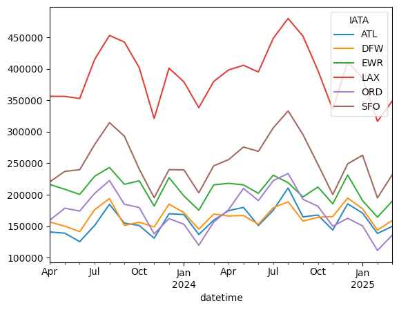
We see some ups and downs, at all of these airports, over the last year, with clear peaks during the summer months. I definitely see a steep drop in February 2025, but it also seems to me that the numbers grew again in March. Moreover, we can see that there was a similar drop from January to February 2024.
So while it's definitely possible that people from outside of the US are cancelling trips en masse, I don't see a dramatic dip beyond what we saw last year at this time.