


This week, we looked at data from the New York Federal Reserve's Center for Microeconomic Data. They have an ongoing Survey of Consumer Expectations (https://www.newyorkfed.org/microeconomics/sce#/), one part of which looks at people's actual and perceived access to credit – including credit cards, mortgages, and auto loans.
The most recent report came out just a few weeks ago, and is another "soft" indicator of potential trouble in the US economy. This, combined with the recent University of Michigan's survey (covered in BW 107, https://www.bambooweekly.com/bw-107-consumer-confidence/) is making some economists nervous that the combination of on-again, off-again tariffs and chaos in the US government will lead to a major economic downturn.
Data and six questions
This week, we're using the "chart data" from the credit-access survey. This data comes in the form of an Excel file that you can get from the following link on the SCE's main page:
I found it helpful and interesting to look through the entire survey questionnaire, available in PDF from here:
This week, I gave you six tasks and questions.
If you're a paid subscriber, then you'll be able to download the data directly from a link at the bottom of this post, download my Jupyter notebook, and click on a single link that loads the notebook and the data into Google Colab, so you can get to work experimenting right away.
Here are my six tasks and questions for you:
Read data from both the the `overall` and `demographics` sheets into data frames. In both cases, use the date as the index, parsing it into a `datetime` value.
For starters, we'll load Pandas:
import pandas as pdNext, the data is in an Excel file. We can load that into a Pandas data frame with read_excel:
df = pd.read_excel(filename)
Except that there are several problems with this:
- I wanted to read from two separate sheets in the data frame
- Each of the Excel spreadsheets has some basic information on the first line, which Excel calls row 1 and we call row 0. The column headers will be in the following line, which Excel calls row 2 and we call row 1.
We can solve both of these problems by passing a list of sheet names to the sheet_name keyword argument:
pd.read_excel(filename,
              sheet_name=['overall', 'demographics'],
              header=1)
The above code tells read_excel to return a data frame for each of those sheet names, and to use row index 1 for the header.
However, what does this return? We know that it's not a single data frame, so what do we get back? The answer is a Python dictionary, in which the sheet names (strings) are the dict's keys, and the data frames themselves are the values. So we could capture the result from read_excel in a dictionary, and then extract the two data frames.
Or we can do something else: In modern Python, the keys (and values) of a dict are kept in chronological order. We can thus use "tuple unpacking" to capture the two data frames:
overall_df, demographics_df = pd.read_excel(filename,
                                  sheet_name=['overall', 'demographics'],
                                  header=1)
In other words, we'll run read_excel, getting a dict back. And because we know that the dict will have two key-value pairs, we'll just assign to our two variables. Each of them will now contain a data frame, and we'll be set to go, right?
Nope: Running the above code will actually assign a string – the name of the data frame – to each variable. That's because tuple unpacking iterates over the value on the right. And when we iterate over a dictionary, we get its keys.
However, we can get its values by running the dict.values method. We'll get the two data frames back, and we can then assign to them:
overall_df, demographics_df = pd.read_excel(filename,
                                  sheet_name=['overall', 'demographics'],
                                  header=1).values()
But wait: Each of these data frames has a date column, taken from Excel. But the date column is in a weird format (YYYYMM), which means that Excel doesn't recognize it as a datetime, and neither does Pandas. We can force Pandas to parse this column as datetime values, and to also indicate what format we want to use, with a combination of the parse_dates and date_format keyword arguments. Note that date_format uses the same sorts of formatting strings as we use in strfmt, which is beautifully documented and testable at https://www.strfti.me/ :
overall_df, demographics_df = pd.read_excel(filename,
                                  sheet_name=['overall', 'demographics'],
                                  header=1,
                                  parse_dates=['date'],
                                  date_format='%Y%m').values()
Finally, we pass the index_col keyword argument to indicate that we want to turn that column into the data frame's index:
overall_df, demographics_df = pd.read_excel(filename,
                                  sheet_name=['overall', 'demographics'],
                                  header=1,
                                  parse_dates=['date'],
                                  date_format='%Y%m',
                                  index_col='date').values()
Our overall_df data frame has 35 rows and 35 columns, whereas our demographics_df data frame has 207 rows and 25 columns.
A common question to ask people about their financial security is whether they could come up with a certain amount of money, given the need. Questions N24 and N25 in the survey ask participants to indicate the percentage chance that they would have an unexpected $2,000 expense in the coming 12 months, and also the percentage chance that they could come up with $2,000 if they needed to. Using the `overall` data frame, produce a line plot comparing these values over the course of the data set. What does this indicate? If we use subplots, does the clarity of the plot change? Does setting the y axis to be 0-100, rather than set automatically, change our interpretation?
What are the chances that you'll need to come up with $2,000 for an unexpected occasion? And what are the chances that you'll be able to do that, if you really need to? These two questions on the survey give us a barometer for how much people are saving and able to deal with emergencies.
We can plot all of the columns in a data frame by invoking plot.line . That'll give us a line plot in which the x axis reflects the data frame's index (i.e., the dates on which survey results were reported, three times each year) and we get one line for each column in the data frame.
We're only interested in two columns, so we can put a list of column names inside of [], returning a much slimmer data frame:
(
    overall_df
    [['ChanceNeed', 'ChanceComeUp']]
)
We can then plot these two columns with plot.line:
(
    overall_df
    [['ChanceNeed', 'ChanceComeUp']]
    .plot.line(subplots=True)
)
The good news is that we get a result:
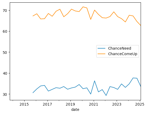
We can see that people believe that they won't have to come up with $2,000 quickly – but that if they need to, many will be able to do so.
There are at least two things we can say about this graph: First, it means that more than 30 percent of Americans would be unable to come up with $2,000 if they needed to do so. Maybe it's not a majority of people, but it's a very large number, and $2,000 is no longer a huge amount of money to need for home or car repairs, or (especially in the US) for medical issues.
A second thing to notice about the graph is that both lines have gone down in the last few months. In other words, fewer people think that they'll need to find $2,000 in a hurry. But fewer people think they'll be able to do so if the issue were to come up. We can see that the orange line, which tracks whether they could come up with $2,000, has been declining (albeit with fits and starts) since the start of 2020.
I asked you to change these plots in two ways, to see if they became clearer. One was to break these two lines into two separate plots. We can do that by passing subplots=True to plot.line:
(
    overall_df
    [['ChanceNeed', 'ChanceComeUp']]
    .plot.line(subplots=True)
)
The result:
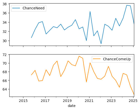
The two plots share an x axis, but have separate and different y axes. While this makes it easier to compare changes, and when they happened, the fact that the y axes are completely different makes this less useful to me.
I can force the y axis to be 0-100, rather than automatically calculated, by passing the ylim keyword argument and a tuple of minimum and maximum values:
(
    overall_df
    [['ChanceNeed', 'ChanceComeUp']]
    .plot.line(ylim=(0, 100))
)
The result:
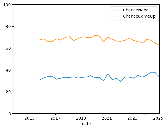
While it shows the gap between each line and the 100 percent mark at the top, which can be useful, the fact that each line had to shrink in order to accommodate the full 0-100 y axis makes it less compelling to me.