


[Administrative note: Paid subscribers are invited to Pandas office hours this coming Sunday! Come with any and all Pandas questions you might have. A full invitation with Zoom info will be sent out tomorrow.]
I've been enjoying cacao nibs for several years. I was thus disappointed (to put it mildly) when I discovered that world cocoa shortages have made the beans so expensive that nib manufacturers and distributors have been priced out of the market. I haven't been able to find them in local stores for a few weeks, and the store owners inform me that they don't know if or when they'll get them back in stock.
Cocoa is one of the products commonly traded at commodity markets around the world. (Other common products are coal, coffee, beef, sugar, and cotton.) These products serve as a barometer of prices and world trade. This is normally useful and important, but that's especially the case nowadays, with Donald Trump's trade war wreaking havoc on markets and business planning.
This week, we'll thus dive into the World Bank's "pink sheet," its monthly report on world commodity prices.
Data and five questions
The pink sheet data, known more formally as the "Commodity markets outlook," has a main Web site at
https://www.worldbank.org/en/research/commodity-markets
You'll want to download the monthly data, which is in the form of an Excel spreadsheet:
This week, I gave you five tasks and questions.
If you're a paid subscriber, then you'll be able to download the data directly from a link at the bottom of this post, download my Jupyter notebook, and click on a single link that loads the notebook and the data into Google Colab, so you can get to work experimenting right away.
Here are my five tasks and questions for you:
Read the monthly-price data into a data frame from the first tab of the Excel file. Ensure that there is a date column based on the first column, which contains a four-digit year, the letter M, and then a two-digit month. Make that the index. The columns should have the textual names, but not the measures from the row under them. Make sure all columns are numeric.
Let's start by loading Pandas:
import pandas as pdWe can read data from an Excel file into Pandas with the read_excel method. Because this file has several sheets, we should name which one we want with the sheet_name keyword argument. We can either pass a string (as I do here) or the integer giving the index (starting with 0) of the sheet:
filename = 'data/bw-109.xlsx'

df = (
    pd
    .read_excel(filename,
                sheet_name='Monthly Prices')
)
But if we do this, we quickly discover that there are a bunch of problems with our data. They mainly come from the fact that the spreadsheet has several rows before the column names appear. The column names then take up two rows.
Rather than use the header keyword argument to grab the column names, and then be stuck with a two-line (or multi-index) set of names for columns, I decided to try something else: I passed header=None to indicate that the column names aren't in the file. I then passed skiprows=6, so that Pandas would start to read from our data on line 6. (Remember that Pandas thinks of the first row as index 0, even though Excel numbers it as 1.)
But before doing that, I invoke read_excel, just grabbing the header names on row 4, and sticking the column names into a variable header_names. I then pass header_names as the value for the names keyword argument in my (main) call to read_excel:
filename = 'data/bw-109.xlsx'

header_names = pd.read_excel(filename,
                             sheet_name='Monthly Prices',
                             header=4).columns
df = (
    pd
    .read_excel(filename,
                sheet_name='Monthly Prices',
                header=None,
                skiprows=6,
                names=header_names)
)
This actually works pretty well! The resulting data frame has the right names and data for each of the columns.
Well... almost. The file indicates that data is missing using two different methods. One is a single-character ellipsis, …. The second is a three-character (and more standard, I'd argue) ellipsis, .... Those are treated as text strings, which means that wherever they appear, a column cannot have a numeric dtype. We'll tell Pandas to interpret these two strings as NaN, which is a float value, by passing the na_values keyword argument:
filename = 'data/bw-109.xlsx'

header_names = pd.read_excel(filename,
                             sheet_name='Monthly Prices',
                             header=4).columns
df = (
    pd
    .read_excel(filename,
                sheet_name='Monthly Prices',
                header=None,
                skiprows=6,
                names=header_names,
                na_values=['…', '...'])
)
Finally, we want to interpret the first (unnamed) column as a date string. Often, when we read data from Excel, the column is automatically seen as a datetime value. But for whatever reason, the World Bank didn't use a date column in Excel. Rather, we got a string in the format of a 4-digit year, followed by M, followed by a two-digit month.
Fortunately, we can pass a combination of the parse_dates keyword argument, indicating that column 0 should be treated as a datetime value. And we can pass the date_format keyword argument, which takes strftime/strptime-style strings for the parsing. We can thus pass %YM%m, which means that we want at four-digit year, the letter M, and a two-digit month:
filename = 'data/bw-109.xlsx'

header_names = pd.read_excel(filename,
                             sheet_name='Monthly Prices',
                             header=4).columns
df = (
    pd
    .read_excel(filename,
                sheet_name='Monthly Prices',
                header=None,
                skiprows=6,
                names=header_names,
                na_values=['…', '...'],
                parse_dates=[0],
                date_format='%YM%m')
)
Our data frame is nearly complete! Now I just want to rename the column, which i can do with the rename method. Here, I pass it a dictionary, indicating the source and destination column names, so that the previously unnamed column is called date. I then use set_index to make date the data frame's index:
filename = 'data/bw-109.xlsx'

header_names = pd.read_excel(filename,
                             sheet_name='Monthly Prices',
                             header=4).columns
df = (
    pd
    .read_excel(filename,
                sheet_name='Monthly Prices',
                header=None,
                skiprows=6,
                names=header_names,
                na_values=['…', '...'],
                parse_dates=[0],
                date_format='%YM%m')
    .rename(columns={'Unnamed: 0': 'date'})
    .set_index('date')
)
We end up with a data frame with 782 rows and 71 columns. All 71 columns have a dtype of float64. And the index contains datetime values, which we call a "time series."
Using Seaborn, plot the price of cocoa during each month over the last five years. Have the plot include a dot for each data point, and label the axes as well as the plot itself. Does the graph show that prices have increased dramatically? Have they come down at all recently?
Matplotlib (https://matplotlib.org/) is the most common and famous plotting library in Python. However, it can be rather complicated to learn and use. Pandas provides a straightforward API for plotting that wraps around Matplotlib, and I generally default to using it, because it makes things so much easier.
But if you want to make your plots a bit nicer looking, or have some more control over them, or just think about things from another perspective, you should look at Seaborn (https://matplotlib.org/). It's also a wrapper around Matplotlib, but it includes a number of plots that Pandas doesn't support. And in many cases, the output is more aesthetic than what you would get from Pandas.
The traditional way to load Seaborn is with an sns alias:
import seaborn as snsTo create a line plot of cocoa prices, over the last five years, we'll first need to limit the number of rows. Five years is the same as 60 months, and since each row in our data frame represents one month of data, we can grab the final 60 rows with iloc, passing it a slice from -60 until the end. That retrieves the entire data frame, but we're only interested in the Cocoa column. We can select for that with []:
(
    df
    .iloc[-60:]
    ['Cocoa']
)
Now we can use a Seaborn plotting function to draw our line plot. Specifically, I'll want to use the lineplot method.
But wait a second – it's fine that Seaborn uses functions, but we want to use a method chain in Pandas, which means invoking methods on our data frame. How can we resolve this?
The answer is the pipe method, which takes a function as an argument, and then passes the data frame to that function. In other words, it allows us to take a function of the form func(df) and invoke it as df.pipe(func). Typically, we'll use a lambda function, which will then invoke whatever we want – in this case, sns.lineplot – for us. Here's a simple version of how to do it:
(
    df
    .iloc[-60:]
    ['Cocoa']
    .pipe(lambda df_: sns.lineplot(df_))
    .set(xlabel='Date',
         ylabel='Price',
         title='Cocoa Prices')
)
We can make the plot a bit fancier by passing the marker='o' keyword argument. This puts a larger dot at each data point we got from the data frame:
(
    df
    .iloc[-60:]
    ['Cocoa']
    .pipe(lambda df_: sns.lineplot(df_, marker='o'))
)
This is enough to show our plot. But we can spruce it up a bit with the set method, setting the xlabel and ylabel values for those axes, and title for an overall title for our plot:
(
    df
    .iloc[-60:]
    ['Cocoa']
    .pipe(lambda df_: sns.lineplot(df_, marker='o'))
    .set(xlabel='Date',
         ylabel='Price',
         title='Cocoa Prices')
)
Here's the result:
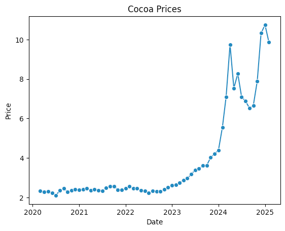
We can see that while cocoa prices have dropped slightly in the last few weeks, they're still at an all-time high, having shot up significantly in just the last six months. And while prices were edging higher over the last few years, they definitely seem to have rocketed up since the start of 2024.